By Don Kirkland, Wrangler News | wn.calicoeng.com publisher
Many of the business and production rules we operated under as novice reporters and editors in L.A. in the 1960s have long since been broken in the pursuit of adjusting to the habits of an unendingly fickle big-city readership.

Those dictates, or at least a significant number of them, have stayed with me these many years, occasionally standing in the way of us adopting new ideas — even when I’ve thought they might enhance our own newspaper’s visual appeal and enjoyment of readership.
Why?
Of all those early-learned rules, the one that stuck with me longest was the one involving change.
Simply said: Don’t.
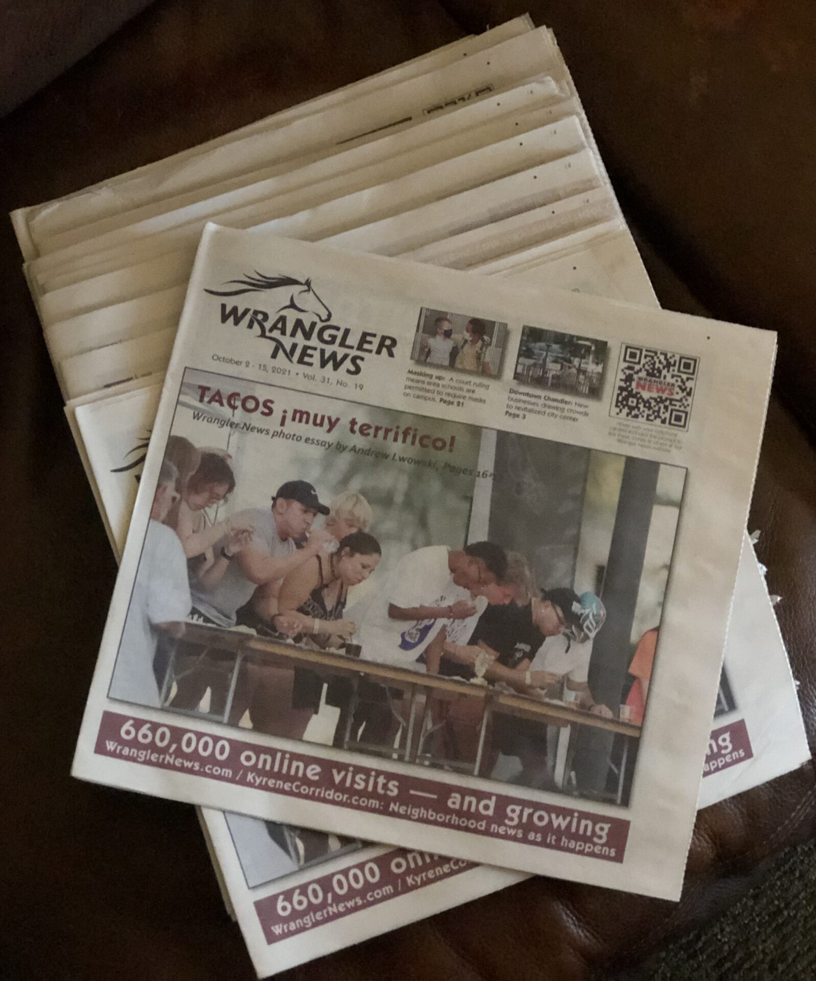
Which brings us to the matter of the exquisitely drawn logo that we have displayed on our website and print cover for the past several years. It’s one of several in our history, starting with our first issue in 1991, that, by design, recognized the number of horse-owner properties in proximity to Warner Road and their connection to the area we serve. It was those origins, in fact, from which was born the Warner Wrangler as many remember it (and still call it), today.
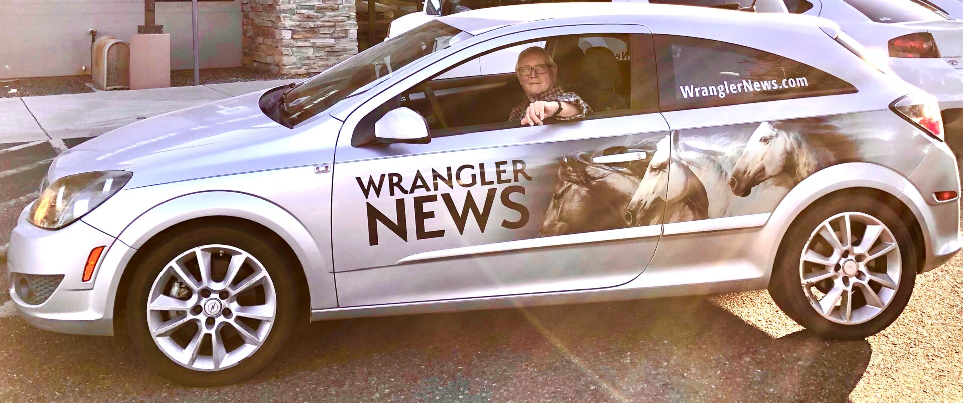
It also is the design feature of our Wrangler News | wn.calicoeng.com car that you likely have seen galloping around town, eliciting friendly waves and serving as a conversation starter with people who appreciate their little hometown paper and what it does to reinforce the sense of community we’ve worked hard to achieve throughout our three decades of publishing.
So when discussion came up of updating our logo design, that old rule of the ’60s came back to haunt me. However, with Wrangler News editor Joyce Coronel, wn.calicoeng.com digital news editor Lee Shappell and intern Noah Kutz pointing out several weeks ago that we want to be sure our design and feel keep pace, graphically and content-wise, with the changing times, I relented.
So we put designer Kiera Campbell to work. A Mountain Pointe High and Fashion Institute of Design & Merchandising (FIDM) in Los Angeles graduate, Kiera knows a good look when she sees one. Or creates one.
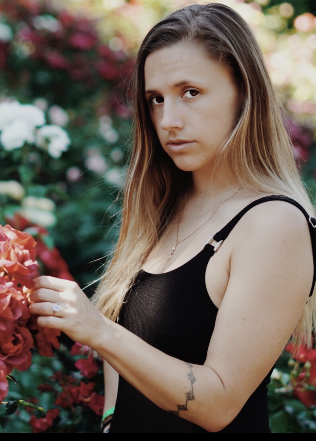
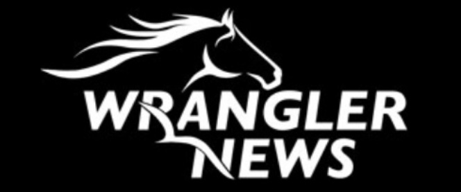
That’s the story behind the new logo you’ve no doubt noticed that we’ve rolled out on our website and in our print edition.
Several months ago, Joyce, Lee, Noah and I talked about ways to ensure that we remain relevant going forward, that our look and feel keep pace with the community around us.
Not only did we discuss the visual part of what we produce, but how our stories support our goal of being a positive source of news and information about our community and the people who live, work, attend school and/or worship here.
Our new logo, we think, achieves all that we hoped it would.
It modernizes our look without sacrificing the premise of a community held together by founding values.
We’ve enjoyed exploring options to modernize our look and feel, and think it’s been a worthwhile process — the new logo and our recently redesigned website included.
Whether it’s white-on-black for online, or black-on-white for print, we hope you like it as much as we do.
 And that the publishing-wise people whose guidance I’ve done my best to follow these many years won’t frown down on me for breaking that No. 1 rule. We like to think it was for a good cause.
